Package com.google.gwt.user.client.ui
Class PushButton
- All Implemented Interfaces:
HasAllDragAndDropHandlers,HasAllFocusHandlers,HasAllGestureHandlers,HasAllKeyHandlers,HasAllMouseHandlers,HasAllTouchHandlers,HasBlurHandlers,HasClickHandlers,HasDoubleClickHandlers,HasDragEndHandlers,HasDragEnterHandlers,HasDragHandlers,HasDragLeaveHandlers,HasDragOverHandlers,HasDragStartHandlers,HasDropHandlers,HasFocusHandlers,HasGestureChangeHandlers,HasGestureEndHandlers,HasGestureStartHandlers,HasKeyDownHandlers,HasKeyPressHandlers,HasKeyUpHandlers,HasMouseDownHandlers,HasMouseMoveHandlers,HasMouseOutHandlers,HasMouseOverHandlers,HasMouseUpHandlers,HasMouseWheelHandlers,HasTouchCancelHandlers,HasTouchEndHandlers,HasTouchMoveHandlers,HasTouchStartHandlers,HasAttachHandlers,HasHandlers,HasSafeHtml,EventListener,Focusable,HasEnabled,HasFocus,HasHTML,HasText,HasVisibility,IsWidget,SourcesClickEvents,SourcesFocusEvents,SourcesKeyboardEvents,SourcesMouseEvents
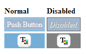
A normal push button with custom styling.
CSS Style Rules
- .gwt-PushButton-up/down/up-hovering/down-hovering/up-disabled/down-disabled {.html-face}
Example
public class PushButtonExample implements EntryPoint {

  public void onModuleLoad() {
    // Make a new button that does something when you click it.
    PushButton b = new PushButton("Jump", "Jump?", new ClickHandler() {
      public void onClick(ClickEvent event) {
        Window.alert("Crash...");
        Window.alert("Uh Oh...");
      }
    });

    // In a real application, you would have to have css styles defined for
    // gwt-PushButton-up,gwt-PushButton-up-hovering,gwt-PushButton-up-disabled,
    // gwt-PushButton-down,.gwt-PushButton-down-hovering,.gwt-PushButton-down-disabled

    // Add the push button to the root panel.
    RootPanel.get().add(b);
  }
}
-
Nested Class Summary
Nested classes/interfaces inherited from class com.google.gwt.user.client.ui.CustomButton
CustomButton.FaceNested classes/interfaces inherited from class com.google.gwt.user.client.ui.UIObject
UIObject.DebugIdImpl, UIObject.DebugIdImplEnabled -
Field Summary
Fields inherited from class com.google.gwt.user.client.ui.Widget
eventsToSinkFields inherited from class com.google.gwt.user.client.ui.UIObject
DEBUG_ID_PREFIX, MISSING_ELEMENT_ERROR, SETELEMENT_TWICE_ERROR -
Constructor Summary
ConstructorsConstructorDescriptionConstructor forPushButton.PushButton(Image upImage) Constructor forPushButton.PushButton(Image upImage, ClickHandler handler) Constructor forPushButton.PushButton(Image upImage, ClickListener listener) Deprecated.PushButton(Image upImage, Image downImage) Constructor forPushButton.PushButton(Image upImage, Image downImage, ClickHandler handler) Constructor forPushButton.PushButton(Image upImage, Image downImage, ClickListener listener) Deprecated.UsePushButton(Image, Image, ClickHandler)insteadPushButton(String upText) Constructor forPushButton.PushButton(String upText, ClickHandler handler) Constructor forPushButton.PushButton(String upText, ClickListener listener) Deprecated.UsePushButton(String, ClickHandler)insteadPushButton(String upText, String downText) Constructor forPushButton.PushButton(String upText, String downText, ClickHandler handler) Constructor forPushButton.PushButton(String upText, String downText, ClickListener listener) Deprecated.UsePushButton(String, String, ClickHandler)instead -
Method Summary
Modifier and TypeMethodDescriptionprotected voidonClick()Called when the user finishes clicking on this button.protected voidCalled when the user aborts a click in progress; for example, by dragging the mouse outside of the button before releasing the mouse button.protected voidCalled when the user begins to click on this button.Methods inherited from class com.google.gwt.user.client.ui.CustomButton
finishSetup, fireClickListeners, getCurrentFace, getDownDisabledFace, getDownFace, getDownHoveringFace, getHTML, getTabIndex, getText, getUpDisabledFace, getUpFace, getUpHoveringFace, isDown, isHovering, onAttach, onBrowserEvent, onDetach, setAccessKey, setCurrentFace, setDown, setEnabled, setFocus, setHovering, setHTML, setHTML, setTabIndex, setText, toggleDownMethods inherited from class com.google.gwt.user.client.ui.FocusWidget
addBlurHandler, addClickHandler, addClickListener, addDoubleClickHandler, addDragEndHandler, addDragEnterHandler, addDragHandler, addDragLeaveHandler, addDragOverHandler, addDragStartHandler, addDropHandler, addFocusHandler, addFocusListener, addGestureChangeHandler, addGestureEndHandler, addGestureStartHandler, addKeyboardListener, addKeyDownHandler, addKeyPressHandler, addKeyUpHandler, addMouseDownHandler, addMouseListener, addMouseMoveHandler, addMouseOutHandler, addMouseOverHandler, addMouseUpHandler, addMouseWheelHandler, addMouseWheelListener, addTouchCancelHandler, addTouchEndHandler, addTouchMoveHandler, addTouchStartHandler, getFocusImpl, isEnabled, removeClickListener, removeFocusListener, removeKeyboardListener, removeMouseListener, removeMouseWheelListenerMethods inherited from class com.google.gwt.user.client.ui.Widget
addAttachHandler, addBitlessDomHandler, addDomHandler, addHandler, asWidget, asWidgetOrNull, createHandlerManager, delegateEvent, doAttachChildren, doDetachChildren, ensureHandlers, fireEvent, getHandlerCount, getHandlerManager, getLayoutData, getParent, isAttached, isOrWasAttached, onLoad, onUnload, removeFromParent, replaceElement, setLayoutData, setParent, sinkEvents, unsinkEventsMethods inherited from class com.google.gwt.user.client.ui.UIObject
addStyleDependentName, addStyleName, ensureDebugId, ensureDebugId, ensureDebugId, getAbsoluteLeft, getAbsoluteTop, getElement, getOffsetHeight, getOffsetWidth, getStyleElement, getStyleName, getStyleName, getStylePrimaryName, getStylePrimaryName, getTitle, isVisible, isVisible, onEnsureDebugId, removeStyleDependentName, removeStyleName, resolvePotentialElement, setElement, setElement, setHeight, setPixelSize, setSize, setStyleDependentName, setStyleName, setStyleName, setStyleName, setStyleName, setStylePrimaryName, setStylePrimaryName, setTitle, setVisible, setVisible, setWidth, sinkBitlessEvent, toStringMethods inherited from class java.lang.Object
clone, equals, finalize, getClass, hashCode, notify, notifyAll, wait, wait, waitMethods inherited from interface com.google.gwt.event.shared.HasHandlers
fireEvent
-
Constructor Details
-
PushButton
public PushButton()Constructor forPushButton. -
PushButton
Constructor forPushButton.- Parameters:
upImage- image for the default(up) face of the button
-
PushButton
Constructor forPushButton. The supplied image is used to construct the default face of the button.- Parameters:
upImage- image for the default (up) face of the buttonhandler- teh click handler
-
PushButton
Deprecated.UsePushButton(Image, ClickHandler)insteadConstructor forPushButton. The supplied image is used to construct the default face of the button.- Parameters:
upImage- image for the default (up) face of the buttonlistener- the click listener
-
PushButton
Constructor forPushButton.- Parameters:
upImage- image for the default(up) face of the buttondownImage- image for the down face of the button
-
PushButton
Constructor forPushButton.- Parameters:
upImage- image for the default(up) face of the buttondownImage- image for the down face of the buttonhandler- the click handler
-
PushButton
Deprecated.UsePushButton(Image, Image, ClickHandler)insteadConstructor forPushButton.- Parameters:
upImage- image for the default(up) face of the buttondownImage- image for the down face of the buttonlistener- clickListener
-
PushButton
Constructor forPushButton. The supplied text is used to construct the default face of the button.- Parameters:
upText- the text for the default (up) face of the button.
-
PushButton
Constructor forPushButton. The supplied text is used to construct the default face of the button.- Parameters:
upText- the text for the default (up) face of the buttonhandler- the click handler
-
PushButton
Deprecated.UsePushButton(String, ClickHandler)insteadConstructor forPushButton. The supplied text is used to construct the default face of the button.- Parameters:
upText- the text for the default (up) face of the buttonlistener- the click listener
-
PushButton
Constructor forPushButton.- Parameters:
upText- the text for the default (up) face of the buttondownText- the text for down face of the button
-
PushButton
Constructor forPushButton.- Parameters:
upText- the text for the default (up) face of the buttondownText- the text for down face of the buttonhandler- the click handler
-
PushButton
Deprecated.UsePushButton(String, String, ClickHandler)insteadConstructor forPushButton.- Parameters:
upText- the text for the default (up) face of the buttondownText- the text for down face of the buttonlistener- the click listener
-
-
Method Details
-
onClick
protected void onClick()Description copied from class:CustomButtonCalled when the user finishes clicking on this button. The default behavior is to fire the click event to listeners. Subclasses that overrideCustomButton.onClickStart()should override this method to restore the normal widget display.- Overrides:
onClickin classCustomButton
-
onClickCancel
protected void onClickCancel()Description copied from class:CustomButtonCalled when the user aborts a click in progress; for example, by dragging the mouse outside of the button before releasing the mouse button. Subclasses that overrideCustomButton.onClickStart()should override this method to restore the normal widget display.- Overrides:
onClickCancelin classCustomButton
-
onClickStart
protected void onClickStart()Description copied from class:CustomButtonCalled when the user begins to click on this button. Subclasses may override this method to display the start of the click visually; such subclasses should also overrideCustomButton.onClick()andCustomButton.onClickCancel()to restore normal visual state. EachonClickStartwill eventually be followed by eitheronClickoronClickCancel, depending on whether the click is completed.- Overrides:
onClickStartin classCustomButton
-
PushButton(Image, ClickHandler)instead