Package com.google.gwt.user.client.ui
Class ToggleButton
- All Implemented Interfaces:
IsEditor<LeafValueEditor<Boolean>>,HasAllDragAndDropHandlers,HasAllFocusHandlers,HasAllGestureHandlers,HasAllKeyHandlers,HasAllMouseHandlers,HasAllTouchHandlers,HasBlurHandlers,HasClickHandlers,HasDoubleClickHandlers,HasDragEndHandlers,HasDragEnterHandlers,HasDragHandlers,HasDragLeaveHandlers,HasDragOverHandlers,HasDragStartHandlers,HasDropHandlers,HasFocusHandlers,HasGestureChangeHandlers,HasGestureEndHandlers,HasGestureStartHandlers,HasKeyDownHandlers,HasKeyPressHandlers,HasKeyUpHandlers,HasMouseDownHandlers,HasMouseMoveHandlers,HasMouseOutHandlers,HasMouseOverHandlers,HasMouseUpHandlers,HasMouseWheelHandlers,HasTouchCancelHandlers,HasTouchEndHandlers,HasTouchMoveHandlers,HasTouchStartHandlers,HasAttachHandlers,HasValueChangeHandlers<Boolean>,HasHandlers,HasSafeHtml,EventListener,TakesValue<Boolean>,Focusable,HasEnabled,HasFocus,HasHTML,HasText,HasValue<Boolean>,HasVisibility,IsWidget,SourcesClickEvents,SourcesFocusEvents,SourcesKeyboardEvents,SourcesMouseEvents
public class ToggleButton
extends CustomButton
implements HasValue<Boolean>, IsEditor<LeafValueEditor<Boolean>>
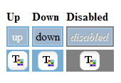
A
ToggleButton is a stylish stateful button which allows the
user to toggle between up and down states.
CSS Style Rules
- .gwt-ToggleButton-up/down/up-hovering/down-hovering/up-disabled/down-disabled {.html-face}
Example
public class ToggleButtonExample implements EntryPoint {
  public void onModuleLoad() {
    // Make a new button that does something when you click it.
    final ToggleButton toggleButton = new ToggleButton("Up", "Down");
    toggleButton.addClickHandler(new ClickHandler() {
      public void onClick(ClickEvent event) {
        if (toggleButton.isDown()) {
          Window.alert("I have been toggled down");
        } else {
          Window.alert("I have been toggled up");
        }
      }
    });

    // In a real application, you would have to have css styles defined for
    // gwt-ToggleButton-up,gwt-ToggleButton-up-hovering,gwt-ToggleButton-up-disabled,
    // gwt-ToggleButton-down,.gwt-ToggleButton-down-hovering,.gwt-ToggleButton-down-disabled

    // Add the ToggleButton to the root panel.
    RootPanel.get().add(toggleButton);
  }
}
-
Nested Class Summary
Nested classes/interfaces inherited from class com.google.gwt.user.client.ui.CustomButton
CustomButton.FaceNested classes/interfaces inherited from class com.google.gwt.user.client.ui.UIObject
UIObject.DebugIdImpl, UIObject.DebugIdImplEnabled -
Field Summary
Fields inherited from class com.google.gwt.user.client.ui.Widget
eventsToSinkFields inherited from class com.google.gwt.user.client.ui.UIObject
DEBUG_ID_PREFIX, MISSING_ELEMENT_ERROR, SETELEMENT_TWICE_ERROR -
Constructor Summary
ConstructorsConstructorDescriptionConstructor forToggleButton.ToggleButton(Image upImage) Constructor forToggleButton.ToggleButton(Image upImage, ClickHandler handler) Constructor forToggleButton.ToggleButton(Image upImage, ClickListener listener) Deprecated.ToggleButton(Image upImage, Image downImage) Constructor forToggleButton.ToggleButton(Image upImage, Image downImage, ClickHandler handler) Constructor forToggleButton.ToggleButton(Image upImage, Image downImage, ClickListener listener) Deprecated.UseToggleButton(Image, Image, ClickHandler)insteadToggleButton(String upText) Constructor forToggleButton.ToggleButton(String upText, ClickHandler handler) Constructor forToggleButton.ToggleButton(String upText, ClickListener listener) Deprecated.UseToggleButton(String, ClickHandler)insteadToggleButton(String upText, String downText) Constructor forToggleButton.ToggleButton(String upText, String downText, ClickHandler handler) Constructor forToggleButton. -
Method Summary
Modifier and TypeMethodDescriptionaddValueChangeHandler(ValueChangeHandler<Boolean> handler) Adds aValueChangeEventhandler.asEditor()Returns the Editor encapsulated by the view object.getValue()Determines whether this button is currently down.booleanisDown()Is this button down?protected voidonClick()Called when the user finishes clicking on this button.voidsetDown(boolean down) Sets whether this button is down.voidSets whether this button is down.voidSets whether this button is down, firingValueChangeEventif appropriate.Methods inherited from class com.google.gwt.user.client.ui.CustomButton
finishSetup, fireClickListeners, getCurrentFace, getDownDisabledFace, getDownFace, getDownHoveringFace, getHTML, getTabIndex, getText, getUpDisabledFace, getUpFace, getUpHoveringFace, isHovering, onAttach, onBrowserEvent, onClickCancel, onClickStart, onDetach, setAccessKey, setCurrentFace, setEnabled, setFocus, setHovering, setHTML, setHTML, setTabIndex, setText, toggleDownMethods inherited from class com.google.gwt.user.client.ui.FocusWidget
addBlurHandler, addClickHandler, addClickListener, addDoubleClickHandler, addDragEndHandler, addDragEnterHandler, addDragHandler, addDragLeaveHandler, addDragOverHandler, addDragStartHandler, addDropHandler, addFocusHandler, addFocusListener, addGestureChangeHandler, addGestureEndHandler, addGestureStartHandler, addKeyboardListener, addKeyDownHandler, addKeyPressHandler, addKeyUpHandler, addMouseDownHandler, addMouseListener, addMouseMoveHandler, addMouseOutHandler, addMouseOverHandler, addMouseUpHandler, addMouseWheelHandler, addMouseWheelListener, addTouchCancelHandler, addTouchEndHandler, addTouchMoveHandler, addTouchStartHandler, getFocusImpl, isEnabled, removeClickListener, removeFocusListener, removeKeyboardListener, removeMouseListener, removeMouseWheelListenerMethods inherited from class com.google.gwt.user.client.ui.Widget
addAttachHandler, addBitlessDomHandler, addDomHandler, addHandler, asWidget, asWidgetOrNull, createHandlerManager, delegateEvent, doAttachChildren, doDetachChildren, ensureHandlers, fireEvent, getHandlerCount, getHandlerManager, getLayoutData, getParent, isAttached, isOrWasAttached, onLoad, onUnload, removeFromParent, replaceElement, setLayoutData, setParent, sinkEvents, unsinkEventsMethods inherited from class com.google.gwt.user.client.ui.UIObject
addStyleDependentName, addStyleName, ensureDebugId, ensureDebugId, ensureDebugId, getAbsoluteLeft, getAbsoluteTop, getElement, getOffsetHeight, getOffsetWidth, getStyleElement, getStyleName, getStyleName, getStylePrimaryName, getStylePrimaryName, getTitle, isVisible, isVisible, onEnsureDebugId, removeStyleDependentName, removeStyleName, resolvePotentialElement, setElement, setElement, setHeight, setPixelSize, setSize, setStyleDependentName, setStyleName, setStyleName, setStyleName, setStyleName, setStylePrimaryName, setStylePrimaryName, setTitle, setVisible, setVisible, setWidth, sinkBitlessEvent, toStringMethods inherited from class java.lang.Object
clone, equals, finalize, getClass, hashCode, notify, notifyAll, wait, wait, waitMethods inherited from interface com.google.gwt.event.shared.HasHandlers
fireEvent
-
Constructor Details
-
ToggleButton
public ToggleButton()Constructor forToggleButton. -
ToggleButton
Constructor forToggleButton. The supplied image is used to construct the default face.- Parameters:
upImage- image for the default face of the button
-
ToggleButton
Constructor forToggleButton. The supplied image is used to construct the default face of the button.- Parameters:
upImage- image for the default (up) face of the buttonhandler- the click handler
-
ToggleButton
Deprecated.UseToggleButton(Image, ClickHandler)insteadConstructor forToggleButton. The supplied image is used to construct the default face of the button.- Parameters:
upImage- image for the default (up) face of the buttonlistener- the click listener
-
ToggleButton
Constructor forToggleButton.- Parameters:
upImage- image for the default(up) face of the buttondownImage- image for the down face of the button
-
ToggleButton
Constructor forToggleButton.- Parameters:
upImage- image for the default(up) face of the buttondownImage- image for the down face of the buttonhandler- the click handler
-
ToggleButton
Deprecated.UseToggleButton(Image, Image, ClickHandler)insteadConstructor forToggleButton.- Parameters:
upImage- image for the default(up) face of the buttondownImage- image for the down face of the buttonlistener- clickListener
-
ToggleButton
Constructor forToggleButton. The supplied text is used to construct the default face of the button.- Parameters:
upText- the text for the default (up) face of the button.
-
ToggleButton
Constructor forToggleButton. The supplied text is used to construct the default face of the button.- Parameters:
upText- the text for the default (up) face of the buttonhandler- the click handler
-
ToggleButton
Deprecated.UseToggleButton(String, ClickHandler)insteadConstructor forToggleButton. The supplied text is used to construct the default face of the button.- Parameters:
upText- the text for the default (up) face of the buttonlistener- the click listener
-
ToggleButton
Constructor forToggleButton.- Parameters:
upText- the text for the default (up) face of the buttondownText- the text for down face of the button
-
ToggleButton
Constructor forToggleButton.- Parameters:
upText- the text for the default (up) face of the buttondownText- the text for down face of the buttonhandler- the click handler
-
-
Method Details
-
asEditor
Description copied from interface:IsEditorReturns the Editor encapsulated by the view object.- Specified by:
asEditorin interfaceIsEditor<LeafValueEditor<Boolean>>- Returns:
- an
Editorof type E
-
getValue
Determines whether this button is currently down. -
isDown
public boolean isDown()Description copied from class:CustomButtonIs this button down?- Overrides:
isDownin classCustomButton- Returns:
trueif the button is down
-
setDown
public void setDown(boolean down) Sets whether this button is down. Does not fireValueChangeEvent. (If you want the event to fire, usesetValue(Boolean, boolean))- Overrides:
setDownin classCustomButton- Parameters:
down-trueto press the button,falseotherwise
-
setValue
Sets whether this button is down. -
setValue
Sets whether this button is down, firingValueChangeEventif appropriate.- Specified by:
setValuein interfaceHasValue<Boolean>- Parameters:
value- true to press the button, false otherwise; null value implies falsefireEvents- If true, and value has changed, fire aValueChangeEvent
-
onClick
protected void onClick()Description copied from class:CustomButtonCalled when the user finishes clicking on this button. The default behavior is to fire the click event to listeners. Subclasses that overrideCustomButton.onClickStart()should override this method to restore the normal widget display.- Overrides:
onClickin classCustomButton
ToggleButton(Image, ClickHandler)instead