Building the UI with GWT Widgets.
In this chapter we'll build a modern looking UI for the TodoList application using the Material Design specifications. We'll be working with the Vaadin gwt-polymer-elements library, a wrapper for the Polymer Paper Elements collection.
Main screen
-
Create the main screen of the application.
We will create a UiBinder screen composed of a java file (
Main.java) and its visual descriptor (Main.ui.xml).You can generate these files either by copying the following snippets, or by using the Eclipse GWT plugin.
-
Main.javapackage org.gwtproject.tutorial; import com.google.gwt.core.client.GWT; import com.google.gwt.uibinder.client.UiBinder; import com.google.gwt.user.client.ui.Composite; import com.google.gwt.user.client.ui.HTMLPanel; public class Main extends Composite { interface MainUiBinder extends UiBinder<HTMLPanel, Main> { } private static MainUiBinder ourUiBinder = GWT.create(MainUiBinder.class); public Main() { initWidget(ourUiBinder.createAndBindUi(this)); } } -
Main.ui.xml<ui:UiBinder xmlns:ui='urn:ui:com.google.gwt.uibinder' xmlns:g='urn:import:com.google.gwt.user.client.ui'> <g:HTMLPanel> </g:HTMLPanel> </ui:UiBinder>
-
-
Adding menu items.
Now we can update the
Main.ui.xmlfile by adding menu items.<ui:UiBinder xmlns:ui='urn:ui:com.google.gwt.uibinder' xmlns:g='urn:import:com.google.gwt.user.client.ui' xmlns:p='urn:import:com.vaadin.polymer.paper.widget' xmlns:i='urn:import:com.vaadin.polymer.iron.widget'> <g:HTMLPanel> <p:PaperIconItem ui:field="menuClearAll"> <i:IronIcon icon="delete" attributes="item-icon"/> <div>Clear All</div> </p:PaperIconItem> <p:PaperIconItem ui:field="menuClearDone"> <i:IronIcon icon="clear" attributes="item-icon"/> <div>Clear Done</div> </p:PaperIconItem> <p:PaperIconItem ui:field="menuSettings"> <i:IronIcon icon="settings" attributes="item-icon"/> <div>Settings</div> </p:PaperIconItem> <p:PaperIconItem ui:field="menuAbout"> <i:IronIcon icon="help" attributes="item-icon"/> <div>About</div> </p:PaperIconItem> </g:HTMLPanel> </ui:UiBinder>Note: in this step we have added the necessary imports for Paper and Iron packages.
Tip: If you are interested on widget details, visit the Iron and Paper widgets Javadoc
-
Update the entry point to use our new screen.
package org.gwtproject.tutorial; import com.google.gwt.core.client.EntryPoint; import com.google.gwt.user.client.ui.RootPanel; public class TodoList implements EntryPoint { public void onModuleLoad() { RootPanel.get().add(new Main()); } } -
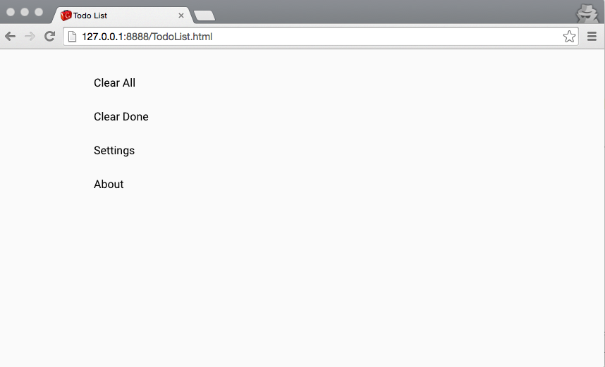
Run the application.
Reload the page in your browser, and you should see the four menu items. You'll probably notice that icons are missing. We'll fix that in the next step.
Icons and effects
-
Import icon collections.
Polymer comes with several icon collections. Before a collection can be used, it has to be imported. In this example we'll be using the Iron set. In the code below, we use the
Polymer.importHrefutility method, and wait for the set to load before we run the application.package org.gwtproject.tutorial; import com.google.gwt.core.client.EntryPoint; import com.google.gwt.user.client.ui.RootPanel; import com.vaadin.polymer.Polymer; import com.vaadin.polymer.elemental.Function; public class TodoList implements EntryPoint { public void onModuleLoad() { // We have to load icon sets before run application Polymer.importHref("iron-icons/iron-icons.html", new Function() { public Object call(Object arg) { // The app is executed when all imports succeed. startApplication(); return null; } }); } private void startApplication() { RootPanel.get().add(new Main()); } } -
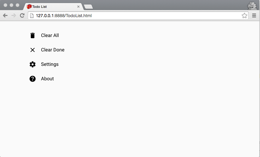
Reload the application
You should see all icons in the browser now.
-
Add a Ripple effect
Feedback when interacting with UI elements is generally considered a positive. If you want, you can read more about Material Design's philosophy regarding responsive interaction.
- Add
<p:PaperRipple/>to each item in theMain.ui.xmlfile. - We need to add a few CSS style properties to the items, so that the ripple effect is constrained within the item area.
<ui:UiBinder xmlns:ui='urn:ui:com.google.gwt.uibinder'
     xmlns:g='urn:import:com.google.gwt.user.client.ui'
     xmlns:p='urn:import:com.vaadin.polymer.paper.widget'
     xmlns:i='urn:import:com.vaadin.polymer.iron.widget'>

    <ui:style>
      paper-icon-item {
        position: relative;
        overflow: hidden;
      }
    </ui:style>

    <g:HTMLPanel>
      <p:PaperIconItem ui:field="menuClearAll">
        <i:IronIcon icon="delete" attributes="item-icon"/>
        <div>Clear All</div>
        <p:PaperRipple/>
      </p:PaperIconItem>
      <p:PaperIconItem ui:field="menuClearDone">
        <i:IronIcon icon="clear" attributes="item-icon"/>
        <div>Clear Done</div>
        <p:PaperRipple/>
      </p:PaperIconItem>
      <p:PaperIconItem ui:field="menuSettings">
        <i:IronIcon icon="settings" attributes="item-icon"/>
        <div>Settings</div>
        <p:PaperRipple/>
      </p:PaperIconItem>
      <p:PaperIconItem ui:field="menuAbout">
        <i:IronIcon icon="help" attributes="item-icon"/>
        <div>About</div>
        <p:PaperRipple/>
      </p:PaperIconItem>
    </g:HTMLPanel>
</ui:UiBinder>
- Add
-
Reload the application to see the ripple effect in action.
Compare click reactions before and after adding
PaperRippleeffects.
Responsive Layout
-
Layout the application with a
PaperDrawPanel.The Paper elements collection includes a responsive drawer panel. It's a layout component that can be used in modern applications to make sure they behave nicely on both desktop and mobile devices. For more information, check out the paper-drawer-panel demo.
<ui:UiBinder xmlns:ui='urn:ui:com.google.gwt.uibinder' xmlns:g='urn:import:com.google.gwt.user.client.ui' xmlns:p='urn:import:com.vaadin.polymer.paper.widget' xmlns:i='urn:import:com.vaadin.polymer.iron.widget'> <ui:style> paper-icon-item { position: relative; overflow: hidden; } </ui:style> <g:HTMLPanel> <p:PaperDrawerPanel ui:field="drawerPanel"> <div drawer=""> <p:PaperHeaderPanel mode="seamed"> <p:PaperToolbar/> <p:PaperIconItem ui:field="menuClearAll"> <i:IronIcon icon="delete" attributes="item-icon"/> <div>Clear All</div> <p:PaperRipple/> </p:PaperIconItem> <p:PaperIconItem ui:field="menuClearDone"> <i:IronIcon icon="clear" attributes="item-icon"/> <div>Clear Done</div> <p:PaperRipple/> </p:PaperIconItem> <p:PaperIconItem ui:field="menuSettings"> <i:IronIcon icon="settings" attributes="item-icon"/> <div>Settings</div> <p:PaperRipple/> </p:PaperIconItem> <p:PaperIconItem ui:field="menuAbout"> <i:IronIcon icon="help" attributes="item-icon"/> <div>About</div> <p:PaperRipple/> </p:PaperIconItem> </p:PaperHeaderPanel> </div> <div main=""> <p:PaperHeaderPanel mode="seamed"> <p:PaperToolbar> <p:PaperIconButton ui:field="menu" icon="more-vert" attributes="paper-drawer-toggle"/> <span>Todo List</span> </p:PaperToolbar> </p:PaperHeaderPanel> </div> </p:PaperDrawerPanel> </g:HTMLPanel> </ui:UiBinder> -
Add the content panel
-
Add a container for our todo items.
  <g:HTMLPanel>
       ...
        <div main="">
            <p:PaperHeaderPanel mode="seamed">
                <p:PaperToolbar>
                    <p:PaperIconButton ui:field="menu" icon="more-vert"
                        attributes="paper-drawer-toggle"/>
                    <span>Todo List</span>
                </p:PaperToolbar>

                <g:HTMLPanel ui:field="content"
                   addStyleNames="vertical center-justified layout" />

            </p:PaperHeaderPanel>
        </div>
       ...
    </g:HTMLPanel>
-
-
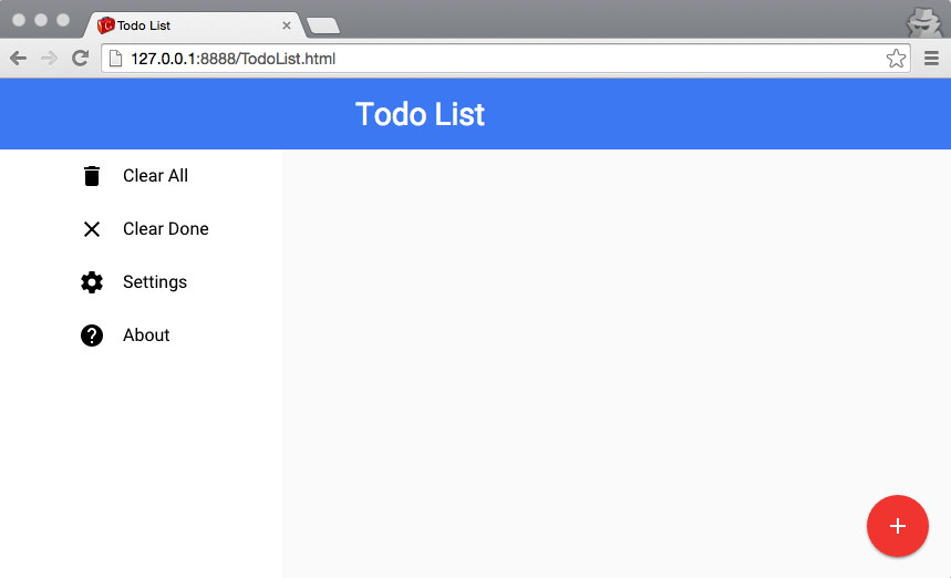
Reload the application
The application should now sport a modern look and be responsive. If you resize the browser window so that its width is below 640px the drawer panel should hide the menu.
Styling the App
Styling with CssResource
When using Polymer widgets you can use GWT GSS parser as usual, and add styles to widgets or elements using the {} operator.
-
Change color of the toolbar, style the header text and the content panel:
<ui:style>
  .toolbar {
    background: #4285f4 !important;
   }
  .header {
    font-size: 200%;
    margin-left: 50px;
    background: #4285f4 !important;
   }
  .content {
    padding: 15px;
   }
   ...
</ui:style>
<g:HTMLPanel>
   ...
    <div main="">
        <p:PaperHeaderPanel mode="seamed">
            <p:PaperToolbar addStyleNames="{style.toolbar}">
                <p:PaperIconButton ui:field="menu" icon="more-vert"
                    attributes="paper-drawer-toggle"/>
                <span class="{style.header}">Todo List</span>
            </p:PaperToolbar>
            <g:HTMLPanel ui:field="content"
                   addStyleNames="{style.content} vertical center-justified layout"/>
        </p:PaperHeaderPanel>
    </div>
   ...
</g:HTMLPanel>
Note: the vertical, center-justified and layout classes are provided by Polymer.
Styling with Polymer
Web Components use Shadow DOM styling rules, providing encapsulated component styles. Additionally, Polymer provides Shady DOM, necessary for browsers not implementing native Shadow DOM. Hence, Polymer monitors and parses each <style> block rewriting rules on the fly.
The GSS processor and the way how GWT loads css resources, make it impossible to use the shadow and polymer selectors, nor Polymer properties inside <ui:style> blocks. Thus, you have to use normal <style> in your UiBinder file.
Another caveat is that GWT defers CssResource loading, so in certain circumstances where you need style rules before the elements are in the DOM, you have to use <style>.
-
Add and stylize the floating action button
Material Design applications use the characteristic floating button for the main action. In the Paper elements collection, this button is called paper-fab.
<ui:style>
...
</ui:style>
<g:HTMLPanel>
  <style is='custom-style'>
    .add {
        position: absolute;
        bottom: 20px;
        right: 20px;
        --paper-fab-background: var(--paper-red-500);
    }
  </style>
  <div main="">
    ...
    <p:PaperFab ui:field="addButton" icon="add"
                addStyleNames="add"/>
  </div>
</g:HTMLPanel>
Tip: In order to make Polymer process your style block add the is="custom-style" attribute.
Tip: Take a look at paper-fab documentation for available custom styling properties and mixins.
Summary
Finally your Main.ui.xml file should look like:
<ui:UiBinder xmlns:ui='urn:ui:com.google.gwt.uibinder'
         xmlns:g='urn:import:com.google.gwt.user.client.ui'
         xmlns:p='urn:import:com.vaadin.polymer.paper.widget'
         xmlns:i='urn:import:com.vaadin.polymer.iron.widget'>

  <ui:style>
    paper-icon-item {
      position: relative;
      overflow: hidden;
    }
    .toolbar {
       background: #4285f4 !important;
    }
    .header {
       font-size: 200%;
       margin-left: 50px;
    }
    .content {
       padding: 15px;
    }
  </ui:style>

  <g:HTMLPanel>
    <style is='custom-style'>
      .add {
        position: absolute;
        bottom: 20px;
        right: 20px;
        --paper-fab-background: var(--paper-red-500);
      }
    </style>
    <p:PaperDrawerPanel ui:field="drawerPanel">
       <div drawer="">
          <p:PaperHeaderPanel mode="seamed">
             <p:PaperToolbar addStyleNames="{style.toolbar}"/>
             <p:PaperIconItem ui:field="menuClearAll">
               <i:IronIcon icon="delete" attributes="item-icon"/>
               <div>Clear All</div>
               <p:PaperRipple/>
             </p:PaperIconItem>
             <p:PaperIconItem ui:field="menuClearDone">
               <i:IronIcon icon="clear" attributes="item-icon"/>
               <div>Clear Done</div>
               <p:PaperRipple/>
             </p:PaperIconItem>
             <p:PaperIconItem ui:field="menuSettings">
               <i:IronIcon icon="settings" attributes="item-icon"/>
               <div>Settings</div>
               <p:PaperRipple/>
             </p:PaperIconItem>
             <p:PaperIconItem ui:field="menuAbout">
               <i:IronIcon icon="help" attributes="item-icon"/>
               <div>About</div>
               <p:PaperRipple/>
             </p:PaperIconItem>
          </p:PaperHeaderPanel>
       </div>
       <div main="">
          <p:PaperHeaderPanel mode="seamed">
            <p:PaperToolbar addStyleNames="{style.toolbar}">
              <p:PaperIconButton ui:field="menu" icon="more-vert"
                                 attributes="paper-drawer-toggle"/>
              <span class="{style.header}">Todo List</span>
            </p:PaperToolbar>
            <g:HTMLPanel ui:field="content"
                         addStyleNames="{style.content} vertical center-justified layout"/>
          </p:PaperHeaderPanel>
          <p:PaperFab ui:field="addButton" icon="add"
                      addStyleNames="add"/>
       </div>
    </p:PaperDrawerPanel>
  </g:HTMLPanel>
</ui:UiBinder>
If everything is OK, after reloading your app should look like this:
What's next
- We have learnt how to create new widgets using
UiBinder. - We can add 3rd party widgets to our UI.
- We know the mechanism for importing Polymer elements like icon collections, and how to use special components that provide visual effects.
- We can work with responsive layouts using Paper panels, and we know how to use them in collaboration with conventional GWT widgets.
- We know how to style elements in UiBinder XML files, using GSS or Polymer parsers.